
Readers rarely visit a DIY blog just to browse. They’re looking for a cutting technique, a mortar mix ratio, or a list of materials for building a partition wall. If the site structure makes them dig through several menus before they find the right page, they’ll leave the blog and open another tab.
Creating a clear site structure means mapping out short paths between visitors’ questions and the answers they need—even when they’re checking their phone with a paintbrush or drill in hand.
Mobile DIY navigation: finding the right step with your hands full
Have you ever tried scrolling through a long tutorial with a finger covered in plaster? It’s hard to be precise, the screen is small, and every missed tap wastes time. Yet this is a common situation: smartphones are the most widely used devices for browsing the web in France.
For a DIY blog, navigation needs to be designed with these real-world conditions in mind. Three structural choices can make a difference.
- Break each tutorial into short steps that can be accessed from a table of contents anchored at the top of the page, using clear labels (“Step 3 – Install the track”) rather than numbers alone. One tap is all it takes to return to the step you’re working on.
- Create practical guides separate from project guides. A short guide to a safety procedure or a specific tool can be consulted in thirty seconds, without scrolling through a long-form article.
- Display a breadcrumb trail that’s easy to read on a small screen. It lets visitors go back one level without returning to the homepage. Note: since late 2023, Google no longer guarantees that breadcrumb trails will appear in mobile search results. They’re still useful on the site itself as a navigation aid, but not as a way to influence how pages appear in search results.
These choices aren’t about graphic design. They’re about site architecture: how pages are connected and how visitors move from one to another.
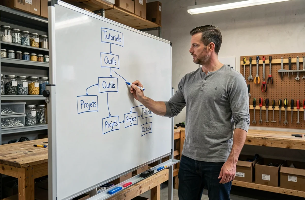
Categories and internal links on a DIY blog
Most blogs organize their articles into a single category: plumbing, electrical, woodworking. The problem soon becomes clear. A tutorial on installing a wall shelf covers woodworking, drilling, and choosing wall plugs for different wall types. Which category should it go in?
Rather than forcing each article into a single category, providing several ways to find the same tutorial works better. An article on installing a shelf could be accessed through the “woodworking” category, a page on “organizing an entryway,” and a practical guide to expansion wall plugs. This internal linking relies on contextual links within the articles, not on adding more sections to the main menu.
A practical example of a clear site structure can be found on the Bricolage En Tout Genre website, whose sitemap groups content visually by topic while providing links between sections.
For the main menu, five to seven items are enough. Beyond that, the navigation bar becomes a wall of text that no one reads in full. Subcategories should appear at the second level, never the third: every page on the blog should be accessible within two clicks from the homepage.
Page structure for tutorials: separating preparation from execution
Readers planning a weekend project have different needs from those in the middle of a job. The first wants to understand the whole process, assess the difficulty, and make a list of materials. The second wants to find a specific instruction without rereading the entire article.
Separating project guides from practical guides that readers can consult while working solves this problem at its source. A project guide covers the full process, mistakes to avoid, and possible alternatives. Practical guides, on the other hand, focus on a single task or tool in just a few paragraphs.
It’s easy to link the two. In the project guide, each step links to the relevant practical guide. In the practical guide, a “related project” box links back to the full guide. This internal linking system creates a network of pages that search engines can crawl easily, strengthening the blog’s organic search visibility.
Use searchable page titles
A category title such as “My Tips” or “Miscellaneous” tells neither visitors nor search engines anything useful. Every page, category, and navigation link should include a word someone might type into Google.
“Tile Installation” is a better section name than “Flooring.” “Measuring Tools” is better than “Equipment.” Clear labels reduce bounce rates because visitors know what they’ll find before they click.
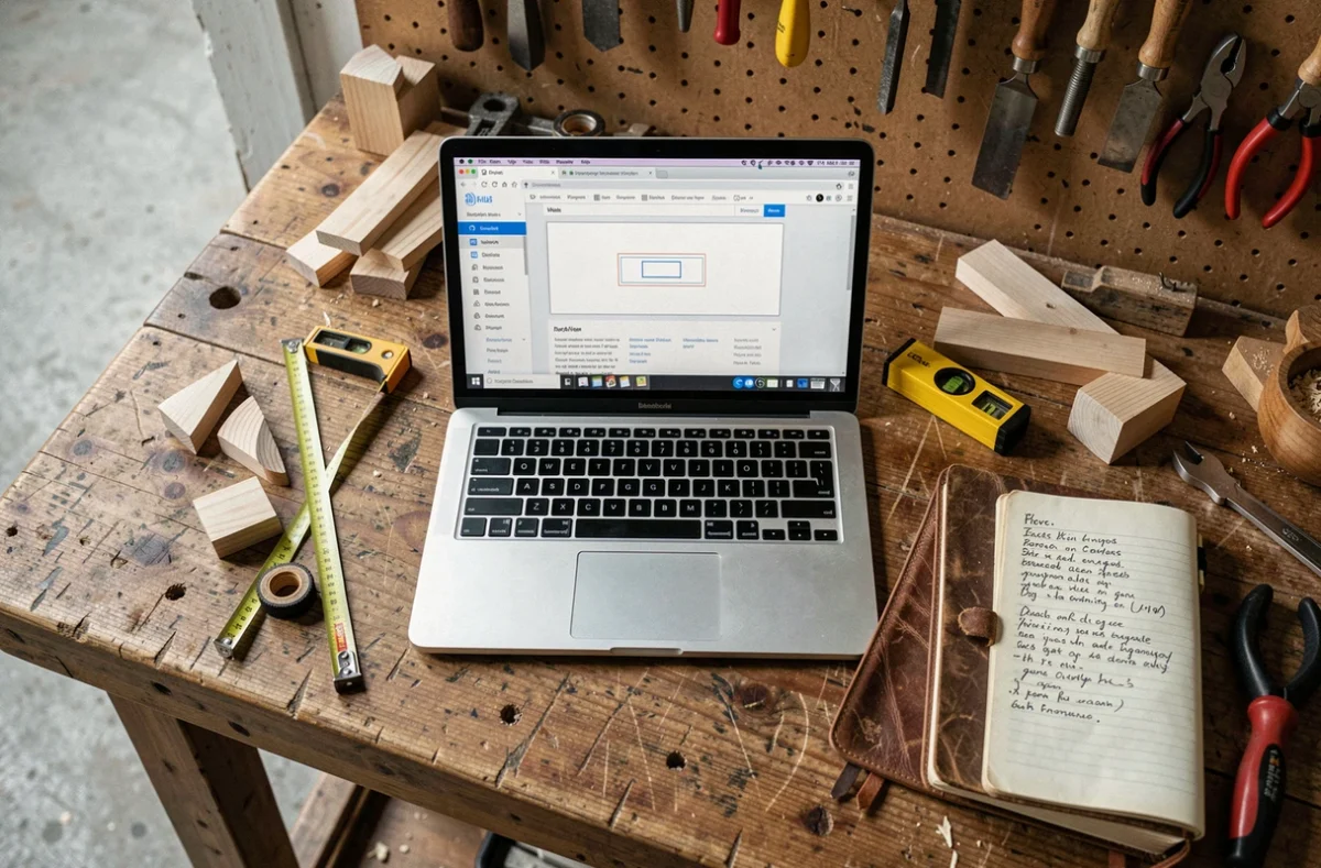
XML sitemap and visible site structure: two complementary tools
A visible sitemap (the “sitemap” page visitors can access) and an XML sitemap file (read by search engine crawlers) serve different purposes. Confusing the two is a common mistake.
The visible sitemap is for human visitors. It displays an organized list of all sections and subsections, with clickable links. For a DIY blog that publishes regularly, this page becomes a living table of contents.
The XML sitemap, on the other hand, tells search engines which pages to crawl first. It includes the last-modified date for each URL, helping Google identify updated content. If you add a new step to an existing tutorial, updating the XML sitemap helps search engines discover the change sooner.
Both should reflect the same site structure. If a page exists in the XML file but doesn’t appear anywhere in the visible navigation, it could become an orphan page—hard for visitors to find and less likely to be valued by search engines.
Structured data: what still works in 2024-2025
Google stopped displaying HowTo rich results in September 2023 and removed the related documentation. There’s no point organizing your site structure around a rich result that no longer exists. It’s better to spend that time creating a clear page layout: numbered steps, a materials list at the beginning of the article, and links to related practical guides.
Article or BreadcrumbList markup is still useful for helping search engines understand page hierarchy, provided the breadcrumb trail displayed on the site exactly matches the markup declared in the code.
A clear sitemap for a DIY blog is about more than a well-organized menu. It brings together long-form pages and short practical guides, connects content with contextual links, and accounts for the fact that readers often browse on their phones in the middle of a project. Consistency between visible navigation, internal links, and the XML sitemap provides the technical foundation for the entire reading experience.